
2023 Digital Signage Design Handbook
Whether you’re designing a digital sign from scratch or using a helpful template, it’s important to understand design best practices. Below, you’ll learn how to create captivating signage and avoid design mistakes. Read on to ensure your message makes an impact on the right audience.
10 Steps to Design Beautiful Digital Signs
Designing a beautiful digital sign is a challenging task. Not only does the sign have to catch the eye, but a message has to be conveyed and understood by the reader in seconds. To accomplish this, consider the elements below as you design your digital signs.
Step 1: Understand Screen Sizing
You can design your digital signage on various viewing devices, such as standard and HDTVs, desktop displays, or tablets. But it’s important to know what visual device will display the design because not all devices will portray the design elements similarly.
The optimal pixel ratio for LED digital signage depends on several factors. These include screen size, viewing distance, and pixel density. Larger screens need a higher pixel ratio to maintain image clarity and detail. Smaller screens may have a lower pixel ratio. Viewing distance is also crucial as it affects how much detail can be perceived by the viewer.
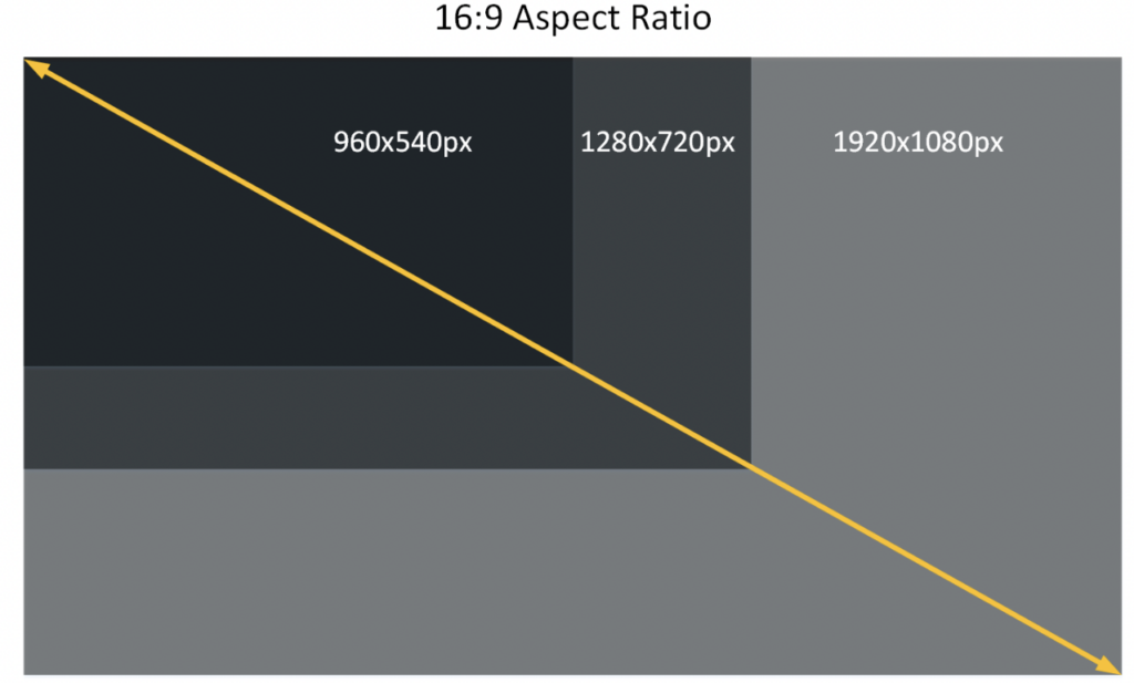
Step 2: Pay Attention to Display Resolution
Next, consider the resolution of the digital signage display. A screen’s resolution is defined by its ability to display physical pixel dimensions.
Desktop displays range from 1024×768 through 1920×1080, while tablets can be 601×962 through 1280×800. Most HDTVs are in 4K resolution To follow digital signage best practices, design for the highest resolution. That way, the quality will remain, whether displaying the message full-screen or scaled down.
Resolution and Pixel Pitch
Choosing the right LED display solution involves several factors such as resolution and pixel pitch, viewing distance, brightness, and content. To achieve the desired system output, a balance between all these criteria is necessary.
What is Pixel Pitch?
Individual LEDs are grouped together in a pixel. Pixel pitch refers to the center-to-center distance between each pixel both vertically and horizontally. The smaller the pitch of a display, the higher the resolution and the closer the viewing distance. The ability to project a good-looking, coherent image is a balance between pixel pitch and viewing distance.
Higher resolution requires higher production costs due to the more extensive LED clusters necessary for pixel density. However, in situations where viewers will be further away from the display, the finest pixel pitch may not be needed. So the right pixel density will be influenced by the viewing distance specific to the signage installation.
Read on to learn how to calculate viewing distance and for insights on design best practices.
Step 3: Use Easy to Read Fonts
Script or other fonts with excessive flourish may catch the eye but can be hard to read. Because viewers will see digital signage from a distance, selecting clear fonts is essential. Sans-serif fonts that don’t have fine lines projecting from the ends of the letters are a great choice for digital signage design.
In addition to font type, sizing is also an important factor. Will viewers be seeing the sign from 5 feet away? In this case, a 20pt font is acceptable. If, on the other hand, viewers will see it from 25 feet away, a 100pt font will be a good choice. Knowing how far the viewer will be from the sign helps ensure your message is legible.
How to Calculate Acceptable Viewing Distance
In the signage industry, there are three methodologies used to determine the acceptable viewing distance.
The first is the Three-foot Rule, which is a shorthand method to calculate an approximate estimate of the Visual Acuity Distance. To calculate the viewing distance in feet, take the pixel pitch and multiply it by 3.
Pixel Pitch x 3 = Approximate Viewing Distance in Feet
The second is Angular Resolution, which is a formulated calculation of the distance a person with 20/20 vision must move away from an LED display to see a coherent image that is not pixelated.
The third is the Average Comfortable Viewing Distance, which is an estimate of what would be a comfortable viewing distance for most people. This is a subjective estimate and takes into account variables like a person’s eyesight, resolution of content, and type of content.
It’s best to partner with a skilled digital signage provider for ease of determining the ideal viewing distance among other variables like brightness, resolution, and the environment the sign will be
placed in.
Step 4: Create Content Layout
Next, it’s time to focus on the content layout. The designer can partition the screen into one or more zones, each assigned to play media files or containing text boxes. To keep it organized, be sure the design takes into account the hierarchy of information. Typical elements in this hierarchy include a heading, body copy, and a call to action.
Step 5: Use Colors Thoughtfully
Because the signage design is for digital screens, RGB color mode is recommended. All colors stem from red, green, and blue on a digital screen. When selecting a color palette, be sure to incorporate contrasting colors so the message comes across easily. A lack of contrast such as light text on a light background prevents signage from making an impact.
Step 6: Format a Message Reading Sequence
You control the sequence in which the viewer sees the message through various elements, such as color, fonts, shapes, and motion. The idea is to have the eye look at the most important part of the message, followed by a sequence that helps the viewer read and understand the message in the few seconds provided. With limited time to get it right, this step is essential. This way, you get the most out of your digital signage.
Step 7: Keep Designs Simple
For legible signage, limit the number of colors and types of fonts used in the content. Visual clutter dilutes a message and can overwhelm viewers. Instead, pick one core message for the display.
In the same vein, too many words on a screen add clutter. Remember, the viewer only has limited time to read a message. So use the ideal dwell time to determine how much content will go on the screen.
Step 8: Add a Call to Action
When designing a digital sign, incorporate a call to action. The message may prompt viewers to visit an online address, sign up for a program, or explore a new in-store offering. When done correctly, calls to action can boost sales, making your digital signage investment well worth it. These CTAs can be tweaked and tested to see which are the most effective at spurring customer action.
Step 9: Pay Attention to Message Transition Times
The right message transition times can create a more positive viewing experience and drive sales. In a survey of restaurants across the US, an impressive 82% cited increased sales when using digital signage to display product information.
The message transition times will vary depending on where the digital sign is located. For example, if it’s in a high-traffic area with people passing by, the message duration may last for 10-30 seconds. However, messages can appear for much longer in areas containing captive audiences like waiting rooms. Again, knowing where the sign will be and the purpose it serves will inform the transition time.
Step 10: Test Your Digital Signage Design
After all the effort that goes into designing digital signage, it’s important to know how messaging is performing. This is where testing comes in. There are many elements that can be altered from the layout to the image to the call to action.
To inform your content strategy, A/B test your digital signage. Alter one variable at a time and measure the results. While A/B testing is useful, it requires a lot of time and resources. Work with a skilled signage provider offering content production services to save time and get a content strategy that performs well.
Digital Signage Design Best Practices
Below, we’ve summed up the most important lessons in this digital signage design guide. Follow these tips for stellar signage:
- Leverage high-quality images: Use the highest-resolution images and videos possible to give your digital signage design a professional look.
- Pick a reliable and easy-to-use CMS: A quality Content Management System (CMS) allows you to create and manage digital signage campaigns easily. These powerful platforms enable users to create dynamic, interactive content that captivates audiences and conveys the right message.
- Ensure your message is clear: Digital signage should have a clear message that can be understood at a glance. Avoid overcrowding your signage with too many elements. Opt for simplicity.
- Test signage and measure results: As with any other type of marketing, it’s essential to measure the results of your digital signage campaigns to ensure that you are getting the most out of your investment. Use A/B testing to identify variables that increase messaging effectiveness.
Design Stunning Digital Signs Easily with ComQi
Creating a beautiful and practical digital sign can be daunting. It requires skill, creativity, and knowledge of design best practices to create something that stands out from the competition. At ComQi, we believe in making signage design accessible and straightforward for any business. We enable you to quickly and easily design custom digital signs that capture your brand and effectively communicate its message.
Get digital signage that fits the needs of your business today.